New Logo + Brand Guide for New York Travel Agent Kate Smith
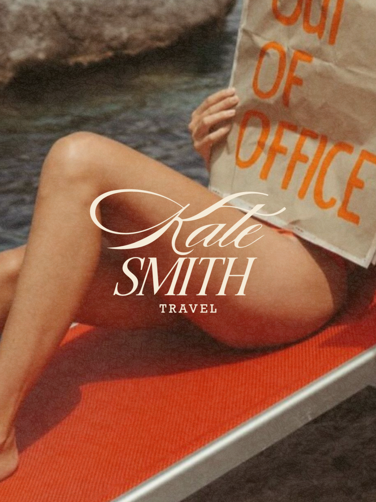
Goals of the new Kate Smith Travel logo:
Create a luxury, sophisticated travel brand.
Feel approachable and personal, not stuffy or corporate.
Balance timeless/classic design with a modern feel.
Stand apart from traditional, dated travel brands.
Create a flexible identity for social media, marketing, and future website use.
Our Solution:
Developed a refined, timeless logo with a feminine, modern feel.
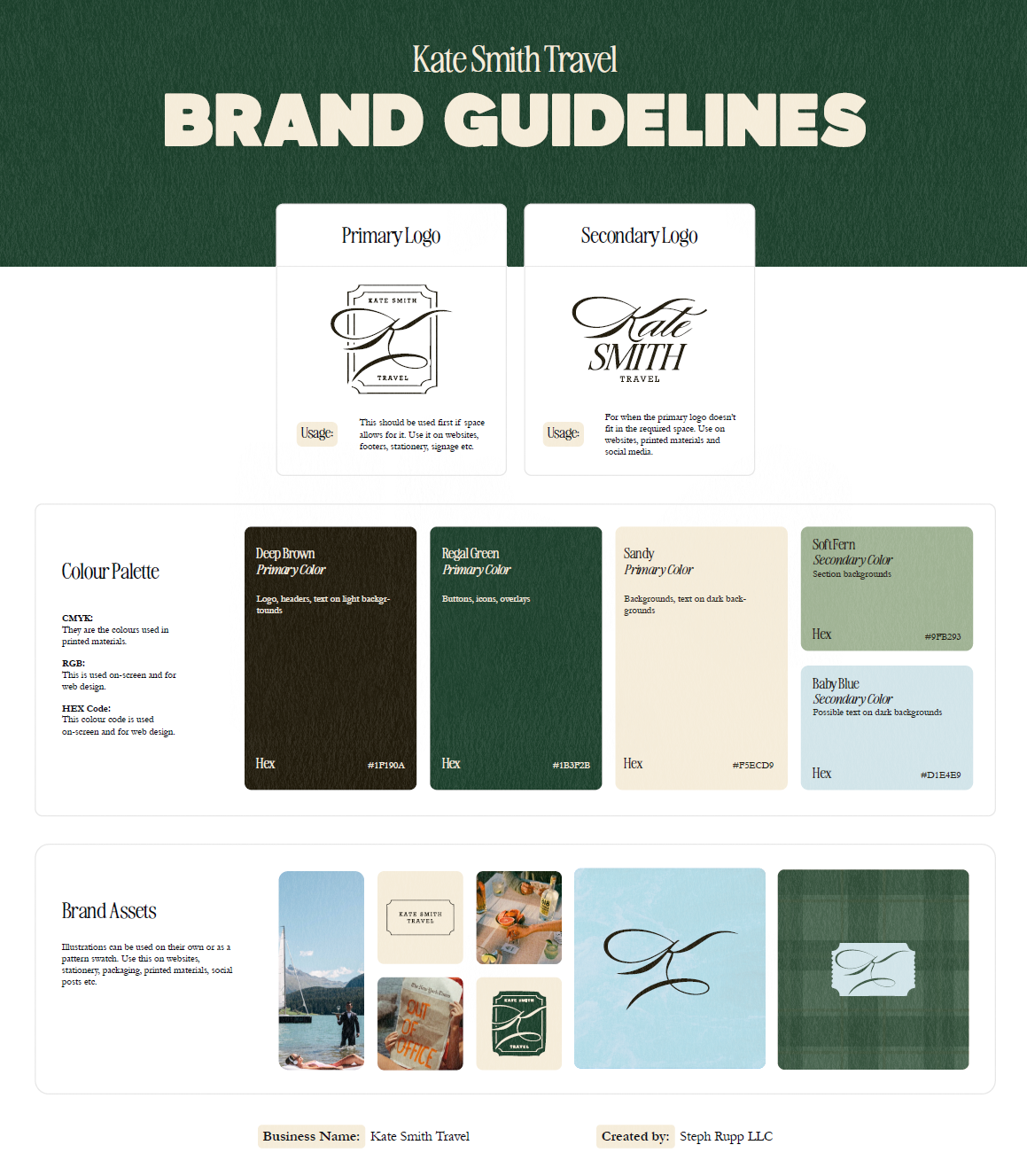
Used an elevated neutral color palette to reinforce the luxury aesthetic.
Created multiple logo variations for different uses and formats.
Removed the more predictable umbrella/travel imagery in favor of a cleaner, more distinctive direction.
Built a cohesive visual system that could feel luxurious without feeling inaccessible.
The goal was to create a sophisticated yet approachable identity for Kate Smith Travel that communicated luxury, personalized service, and expertise without feeling dated or like a traditional travel agency. The solution was a timeless, feminine, modern visual system built around an elevated neutral palette, refined typography, flexible logo variations, and a distinctive approach to travel branding that avoided overly literal imagery like the umbrella.


Hi there, I’m Steph Rupp!
Thank you for checking out my portfolio! I am a freelance website designer, photographer and graphic designer out of Kansas City, Kansas.
👈 I thought this photo frame looked like an egg and that’s why I chose it.
I love working with new people and learning about new industries - so don’t hesitate to reach out!